Classic Creations
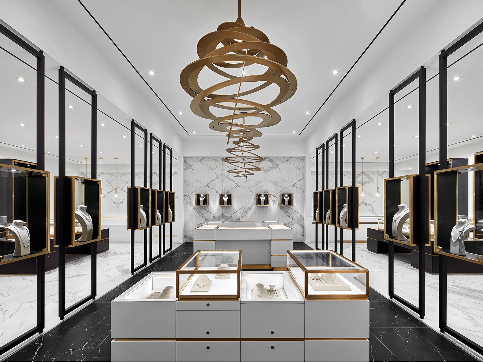
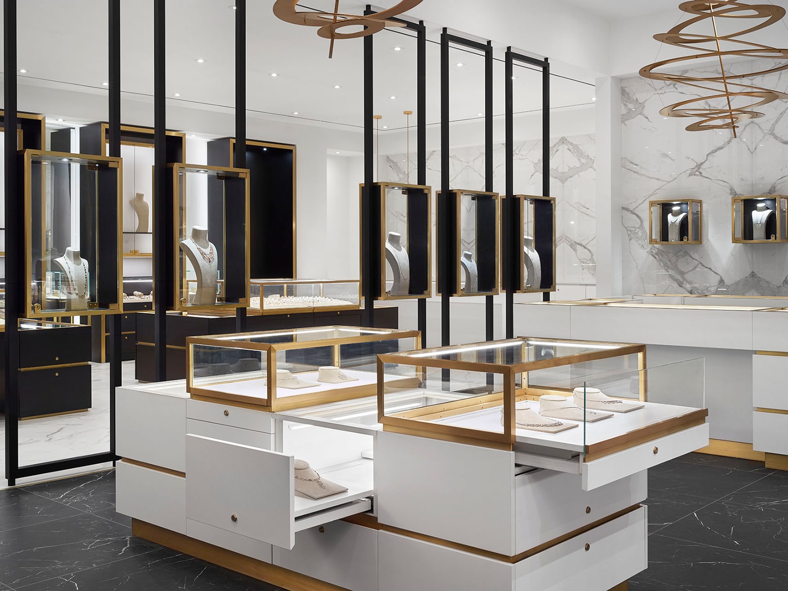
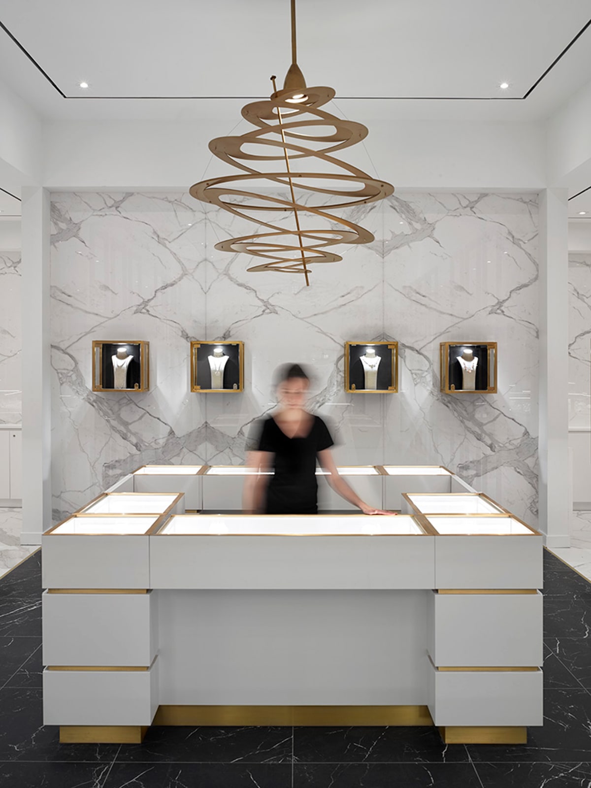
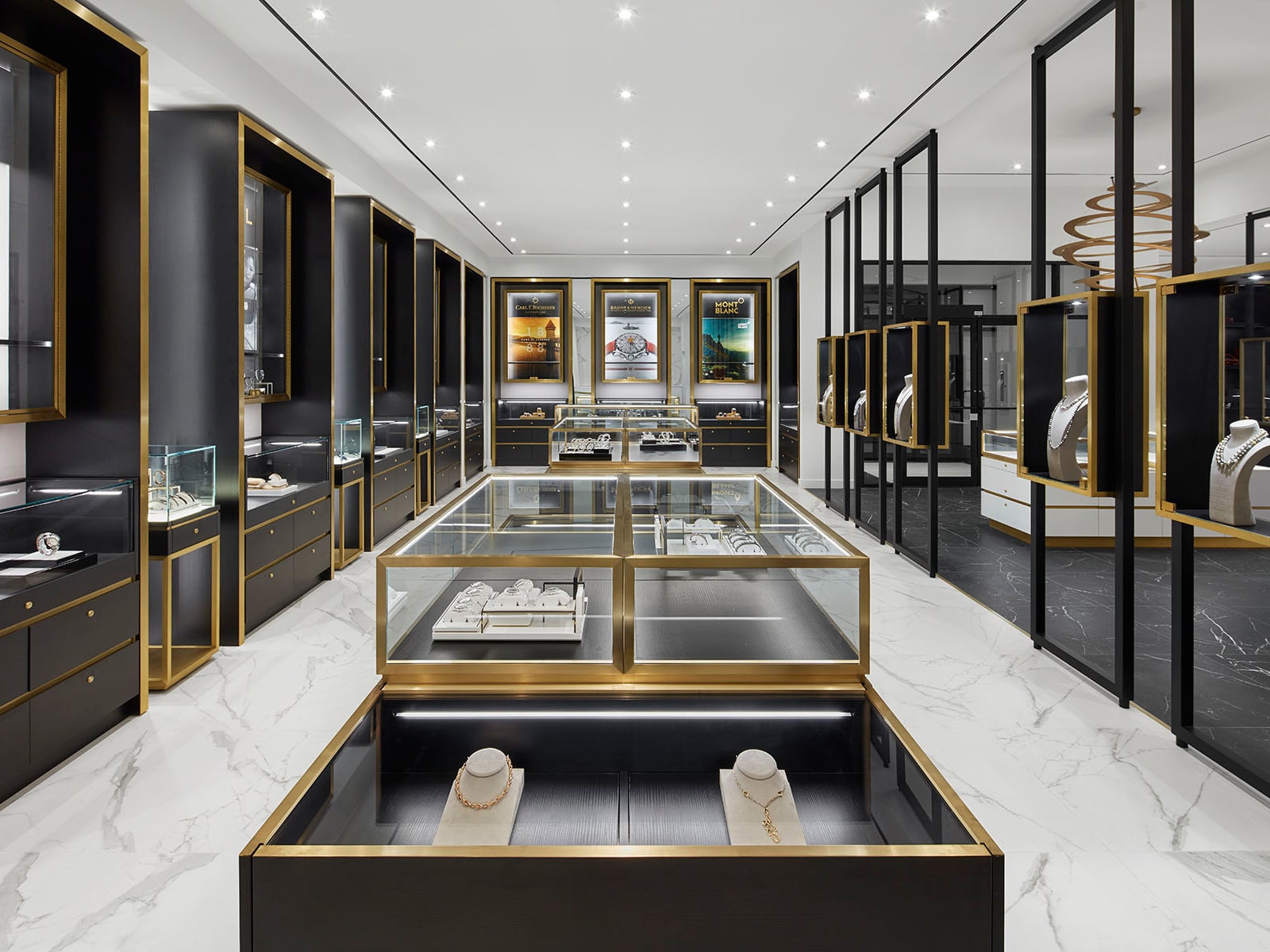
A luxurious backdrop would showcase both the store’s own popular product line and a range of other brands, with a simplified display area, a warm black-and-white color palette, and rose-gold metal accents for a hint of color.
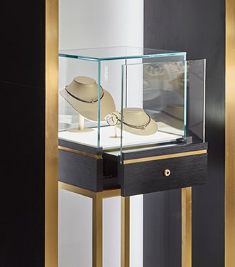
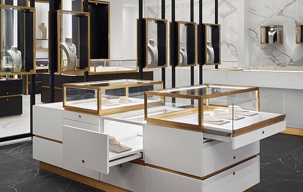
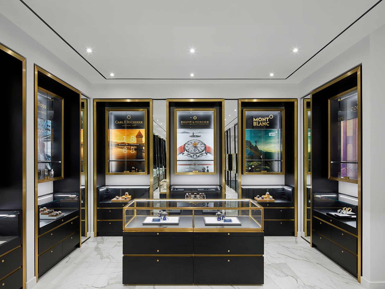
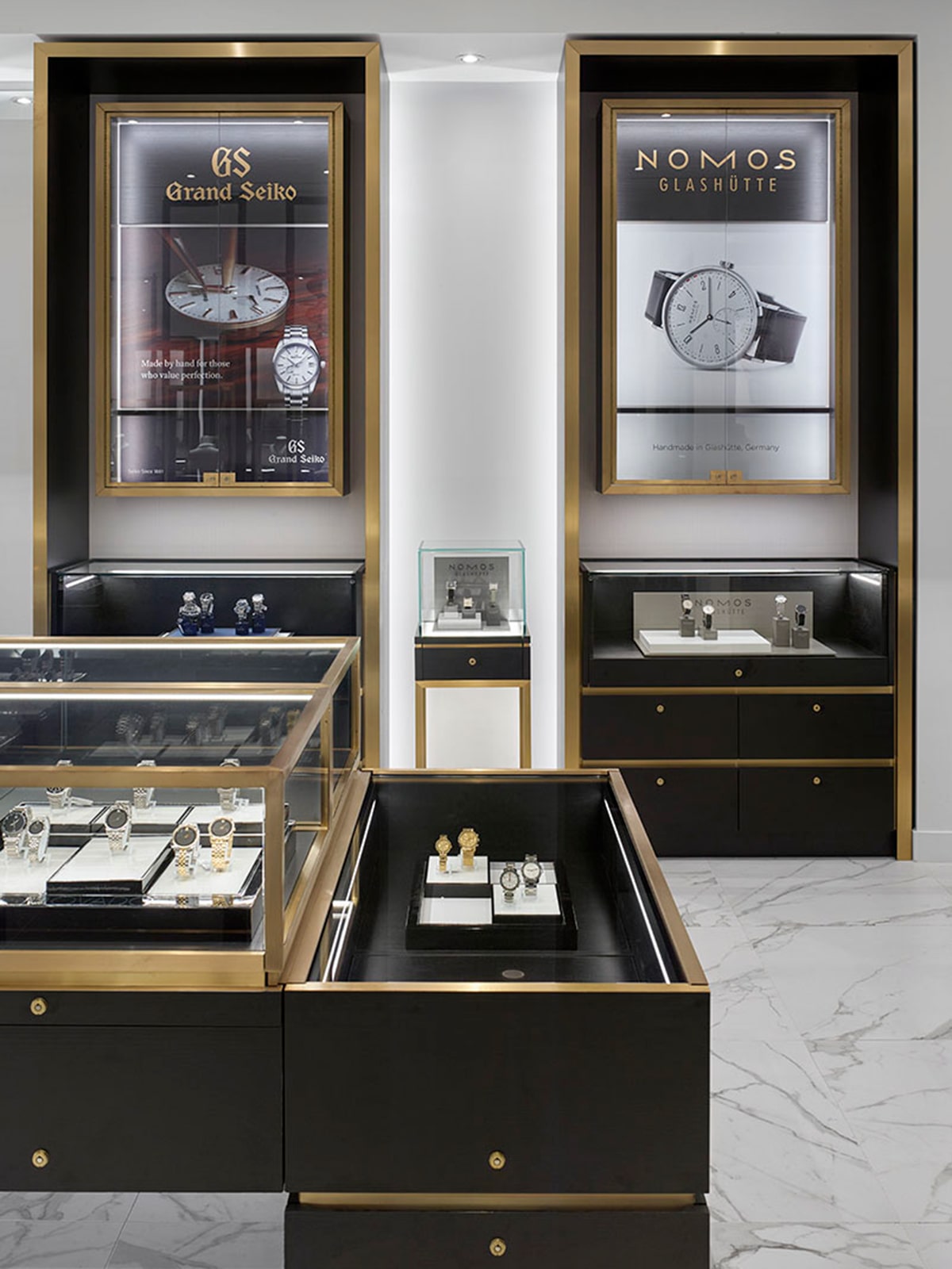
“Jewellery stores can traditionally feel over-cluttered, with brands and products competing for attention. Our challenge was to create a visual style that was simple and minimalistic, bringing focus to the stunning jewelry on display,” says Cecconi Simone principal Anna Simone. “To accomplish that, we installed custom jewelry cases and employed contrasting tones that carry the eyes to key focal points. The result is sophisticated but not intimidating – and makes the jewelry the star.”
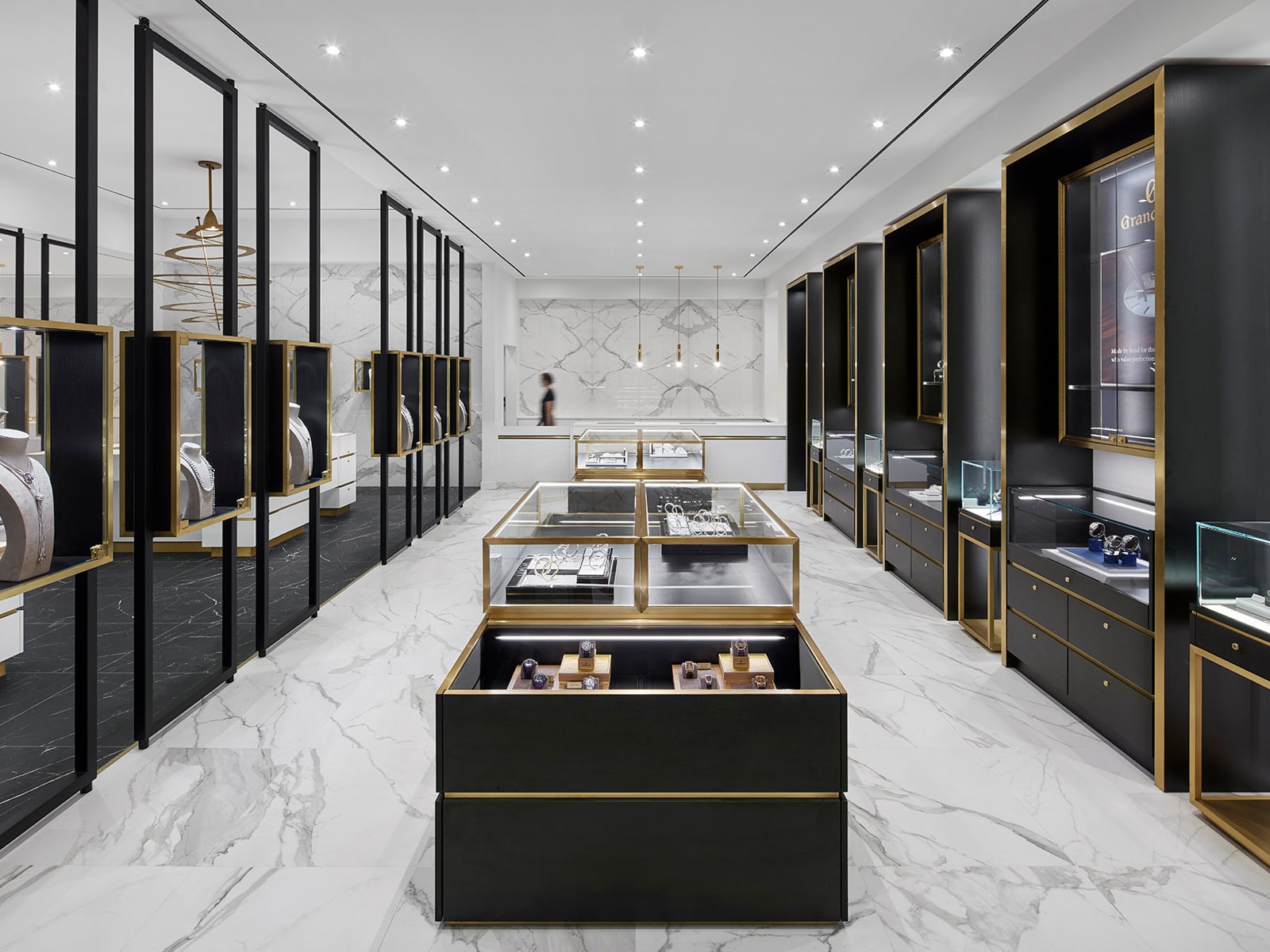
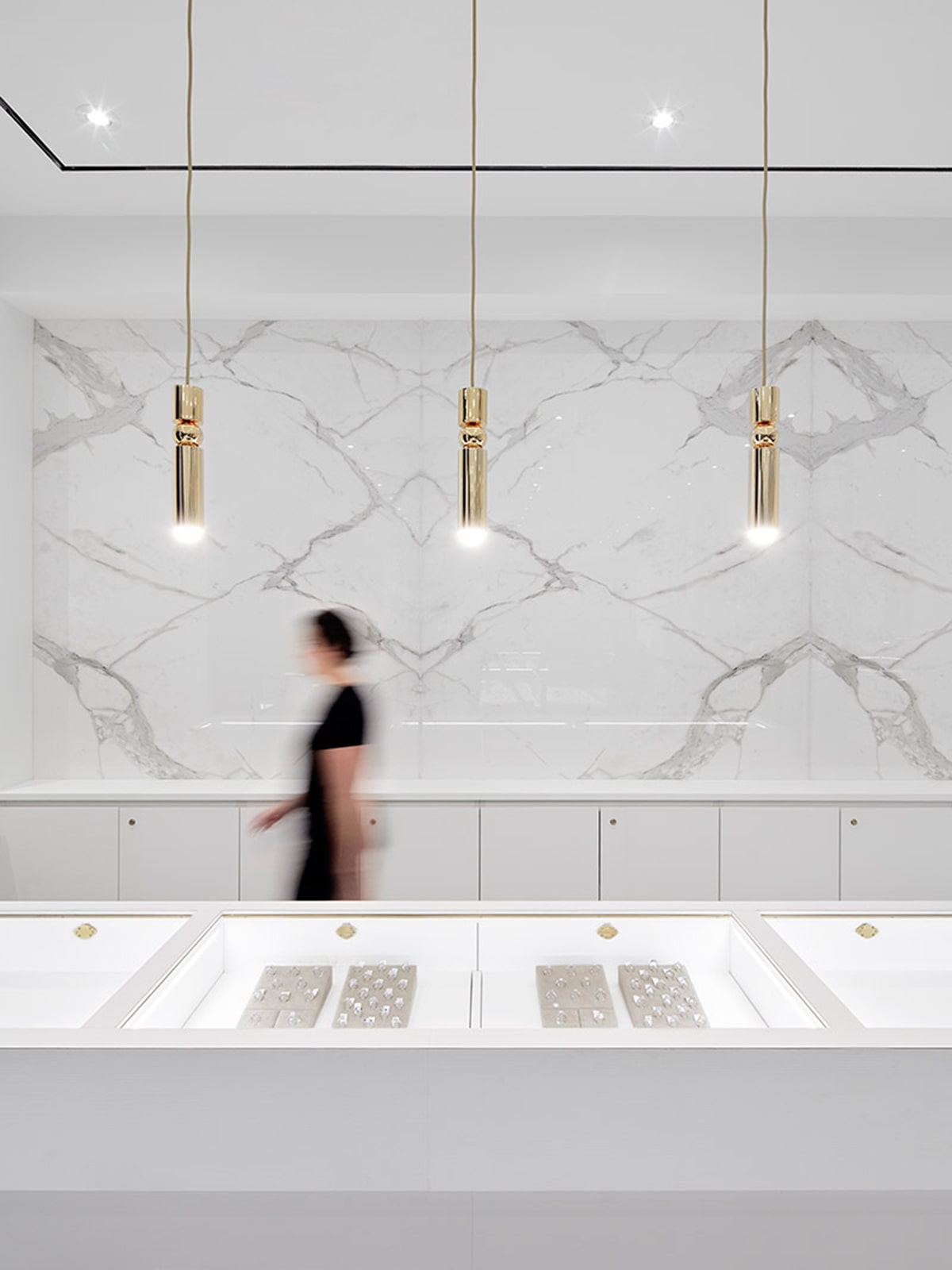
A monochromatic white-on-white zone draws eyes first, forming a spine through the center of the shop and acting as a backdrop for featured displays. On either side, black-on-white zones lead shoppers through, inviting them to peruse both the store brands and those they support. Custom wood-and-glass cases create continuity throughout – treating the jewelry like art in a gallery and removing the clutter of competing brand marketing – while rose-gold metal highlights both the display cases and accent lighting. The same metal twists like a delicate necklace through a dramatic focal-point light fixture above, drawing eyes to a fixture that feels like a piece of jewelry itself.
LOCATION
DESIGNER
Toronto
Cecconi Simone

Details